The dining room holds a special place in the home. It’s where we gather for holiday feasts, celebrate birthdays with cake, or simply share stories about our day over a Tuesday night casserole. Unlike the kitchen, which is all about utility and hustle, the dining room is about pausing and connecting. Because of this, the atmosphere you create here matters deeply, and nothing sets that atmosphere quite like the color on the walls.
Choosing the right paint color can feel like a high-stakes decision. You want it to look beautiful by candlelight but also inviting during a Sunday brunch. You want it to match your furniture but also reflect your personality. If you are standing in front of a wall of paint chips feeling overwhelmed, take a deep breath. This guide is designed to walk you through the process of selecting the perfect hue for your dining space, step by step.
Contents
- 1 Understanding the Mood You Want to Create
- 2 Assessing Your Lighting Situation
- 3 Working with What You Have
- 4 Choosing the Right Finish
- 5 Popular Color Families for Dining Rooms
- 6 Comparison: Dark vs. Light Dining Rooms
- 7 The Importance of Sampling
- 8 Creative Paint Applications
- 9 Flow with the Rest of the Home
- 10 Common Mistakes to Avoid
- 11 Final Thoughts on Personal Style
- 12 Frequently Asked Questions (FAQ)
Understanding the Mood You Want to Create
Before you even look at a color wheel, you need to decide how you want the room to feel. The “vibe” of the room will dictate the color family you should explore.
Formal vs. Casual Atmosphere
Are you the type of host who loves linen napkins, fine china, and three-course meals? Or is your dining style more about pizza boxes, game nights, and mismatched chairs?
For a formal dining room, deep, rich colors often work best. Think navy blue, charcoal gray, or a deep forest green. These colors create a sense of intimacy and drama. They make the walls recede, drawing attention to the table and the people around it.
For a casual dining space, lighter, airier colors are usually the way to go. Soft neutrals, pastels, or warm whites keep the energy light and friendly. These shades make the room feel open and flexible, ready for breakfast with the kids or a coffee break in the afternoon.
The Psychology of Hunger and Conversation
Believe it or not, color can influence appetite and social interaction.
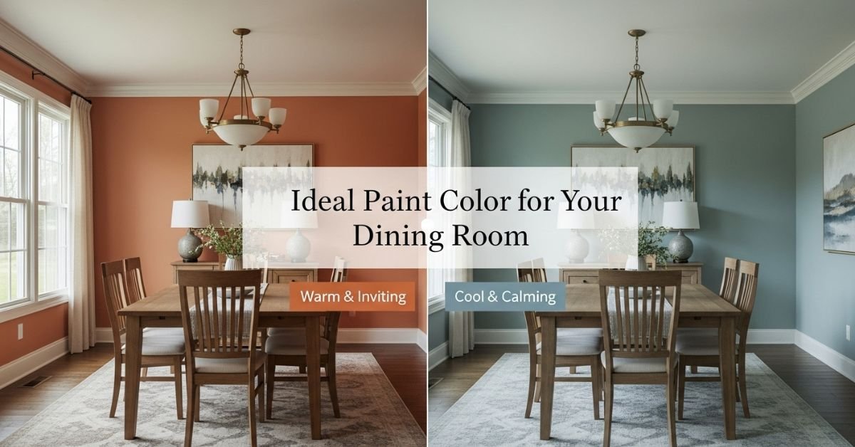
- Red and Orange: These are known as stimulating colors. They are believed to increase appetite and encourage lively conversation. While painting an entire room bright fire-engine red might be too intense, terra cotta, rust, or a deep burgundy can add warmth and energy without shouting.
- Blue: Traditionally, blue is said to suppress appetite because there are very few naturally blue foods. However, this rule is fading. A rich teal or a soft slate blue can look stunning and sophisticated.
- Yellow: This is a happy, welcoming color that mimics sunshine. It’s great for breakfast nooks or dining rooms that don’t get a lot of natural light.
Assessing Your Lighting Situation
Light is the single biggest factor in how a paint color looks on your wall. A color that looks like a soft beige in the store might look pink in your dining room, or a nice gray might turn purple.
Natural Light
Take note of the windows in your dining room. Which direction do they face?
- North-facing rooms: These rooms get cool, indirect light. Cool colors (blues, greens, grays) can feel flat or chilly here. To counter this, choose colors with warm undertones, like a creamy white or a greige (gray-beige) that leans toward brown.
- South-facing rooms: These rooms are flooded with warm, intense light. Almost any color works here, but cool colors can help balance the warmth and keep the room from feeling too hot.
- East-facing rooms: You get bright morning light but shadows in the evening. If you use the room mostly for dinner, make sure you test the color under artificial light.
- West-facing rooms: These get the golden hour glow in the late afternoon. Warmer colors can become very intense here, turning orange or red tones almost fiery.
Artificial Light
Most dining happens after the sun goes down. Your chandelier, sconces, or buffet lamps will be the primary light source.
- Incandescent bulbs cast a warm, yellow glow that enhances reds and oranges but dulls blues.
- LED bulbs come in various “temperatures.” A cool white LED can make a room feel clinical, while a warm white mimics traditional bulbs.
- Dimmer switches are a dining room’s best friend. Being able to lower the lights instantly makes any paint color feel richer and more intimate.
Working with What You Have
Unless you are renovating an empty house, you likely have existing elements in the room that aren’t changing. Your paint color needs to play nice with these fixed features.
The Flooring Factor
Your floor is the second largest surface in the room after the walls. If you have honey-colored oak floors, a cool gray wall might clash. If you have dark walnut floors, a very dark wall color might turn the room into a cave.
- Warm wood floors pair beautifully with warm neutrals, greens, and blues with warm undertones.
- Cool or gray-toned floors work well with stark whites, cool grays, and modern blues.
Furniture and Fabrics
Look at your dining table, chairs, rug, and curtains. Is there a dominant color in the rug? Is the upholstery on the chairs a specific pattern? You can pull a color directly from a piece of art or a rug to use on the walls.
Ideally, you want contrast. If you have a heavy, dark mahogany table, a lighter wall color will let the furniture stand out. If you have a white farmhouse table, a darker wall color will make the white pop.
Choosing the Right Finish
The sheen of the paint is just as important as the color itself. In a dining room, you have to balance durability with aesthetics.
Flat or Matte
This finish has no shine. It is excellent for hiding imperfections in older walls (like bumps or cracks) and provides a velvety, sophisticated look. It is very popular for deep, moody dining room colors. However, it is the hardest to clean. If you have young children who might fling spaghetti sauce, this might be risky.
Eggshell or Satin
This is the “Goldilocks” finish. It has a slight luster—like an eggshell—that reflects a little bit of light but isn’t shiny. It is easier to wipe down than flat paint but still hides minor wall flaws. This is the most common choice for dining rooms.
Semi-Gloss
This is shiny and reflects a lot of light. It is very durable and scrubbable. However, it highlights every bump on the wall. Generally, semi-gloss is reserved for trim, doors, and wainscoting, rather than the main walls.
Popular Color Families for Dining Rooms
Sometimes it helps to see what has worked for others. Here is a breakdown of popular color families and why they work in dining spaces.
The New Neutrals
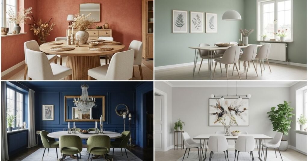
Beige is back, but it’s not the boring builder-beige of the 90s. We are seeing “greige” (gray + beige), taupe, and mushroom colors. These provide a warm, earthy backdrop that lets your food and guests be the stars of the show. They are safe but sophisticated.
Moody Blues and Greens
Navy blue, charcoal, and forest green are incredibly popular right now. They make a space feel cozy and enclosed, which is perfect for long, lingering dinner parties. If you choose a dark color, ensure you have good lighting so it doesn’t feel gloomy.
Crisp Whites
An all-white dining room can feel like an art gallery—clean, modern, and fresh. The key is to choose a white that isn’t too sterile. Look for whites with a tiny bit of yellow or gray to give them depth. White walls look fantastic with natural wood furniture and greenery.
Unexpected Pastels
A soft blush pink or a pale sage green can act as a neutral. These colors add a touch of personality without being overwhelming. Blush, in particular, is known to be very flattering to skin tones, making everyone at the table look a little healthier and happier.
Comparison: Dark vs. Light Dining Rooms
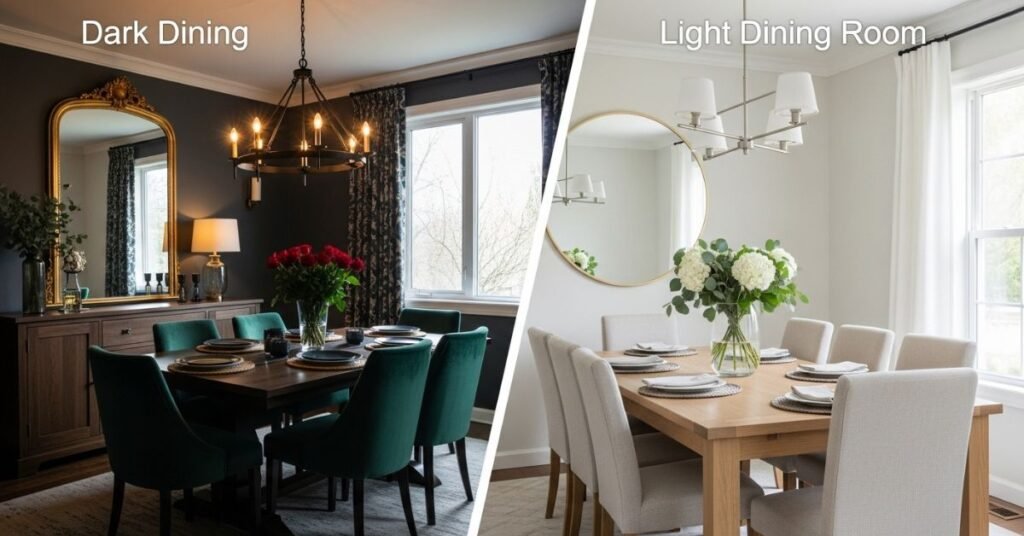
To help simplify the decision between a dramatic look and an airy look, here is a quick comparison of how these choices impact the room.
| Feature | Dark & Moody Colors (Navy, Charcoal, Forest Green) | Light & Airy Colors (White, Beige, Pale Blue) |
|---|---|---|
| Primary Vibe | Intimate, formal, cozy, dramatic | Open, casual, energetic, spacious |
| Perception of Space | Makes large rooms feel cozier; can make small rooms feel “jewel-box” like | Makes small rooms feel larger and ceilings feel higher |
| Lighting Needs | Requires excellent artificial lighting (chandeliers, sconces) | Maximizes natural light; reflects light well |
| Furniture Pairing | Highlights light-colored wood, metallics (gold/brass), and white trim | Highlights dark wood furniture, colorful art, and dark floors |
| Best Occasions | Dinner parties, evening gatherings, holiday feasts | Breakfast, brunch, lunch, daytime workspace |
| Maintenance | Scuffs and dust can show more easily on dark matte walls | Easier to touch up; scuffs may be less visible depending on sheen |
The Importance of Sampling
Never buy five gallons of paint based on a paper chip. The most critical step in this entire process is testing the paint in your actual room.
How to Test Paint Correctly
- Buy Sample Pots: Pick your top 3 favorite colors and buy small sample jars.
- Paint Large Swatches: Don’t just paint a tiny square. Paint a large section (at least 2 feet by 2 feet) on the wall. Even better, paint a large piece of poster board or foam core. This allows you to move the color around the room to different walls.
- Watch the Clock: Look at the color in the morning, at noon, and at night with the lights on. A color can transform completely throughout the day.
- Live with It: Leave the swatches up for a few days. See how they make you feel when you walk past the room.
Creative Paint Applications
Who says you have to paint all four walls the same color? The dining room is a great place to experiment with paint placement.
The Accent Wall
If you love a bold color like emerald green but are afraid it will be too much, paint just one wall. Usually, this should be the wall that anchors the room—perhaps the one with the buffet or the main piece of art.
The Ceiling ( The Fifth Wall)
Don’t ignore the ceiling. Painting the ceiling a shade lighter than the walls can make the room feel taller. Conversely, painting the ceiling a dark color can lower the visual height and make a high-ceilinged room feel cozier. Some designers even use a high-gloss paint on the ceiling to reflect candlelight.
Two-Tone Walls
If you have chair rails or wainscoting, you have a perfect opportunity for two-tone walls. A classic look is white wainscoting on the bottom and a rich color on top. This gives you the best of both worlds: the brightness of white and the drama of color.
Color Drenching
This is a modern trend where you paint the walls, the trim, the baseboards, and sometimes even the ceiling the exact same color. It creates a seamless, contemporary look that is very immersive. It works particularly well with moodier colors.
Flow with the Rest of the Home
Your dining room doesn’t exist in a vacuum. It is likely connected to your kitchen, living room, or hallway.
If you have an open-concept floor plan, the dining room color needs to harmonize with the adjacent spaces. It doesn’t have to be the exact same color, but it should be a “cousin.” For example, if your living room is a soft gray-blue, a navy blue dining room will flow nicely. If your kitchen is warm beige, a cool gray dining room might feel jarring.
Walk from room to room and see how the colors transition. You want a sense of continuity. Using a consistent trim color (like a specific white) throughout the entire floor can help tie different wall colors together.
Common Mistakes to Avoid
Even with the best intentions, homeowners often make a few common errors.
- Matching Too Perfectly: You don’t need a wall color that exactly matches the blue in your rug. That can look flat and overly designed. Instead, aim for a color that coordinates or complements.
- Ignoring the Undertones: This is the “gray looked purple” problem. Always compare your paint chip to a piece of pure white paper to see the hidden undertones.
- Rushing the Process: Paint is relatively cheap, but the labor (even if it’s your own) is expensive. Take your time selecting the color so you don’t have to repaint in six months.
- Forgetting the Trim: If your trim is an old, yellowed white, a fresh, crisp blue wall might make the trim look dirty. You may need to paint the trim at the same time to get a clean look.
Final Thoughts on Personal Style
Ultimately, the “ideal” paint color is the one that makes you happy. Trends come and go. Gray was the king for a decade, now warmth is returning. Next year, it might be something else entirely.
Your dining room is a backdrop for your life. If you love bright purple and it makes you smile every time you eat toast, then paint it bright purple. Use these tips as guardrails to help you avoid technical mistakes, but let your heart drive the final decision.
When the painting is done, and the tape is peeled away, the goal is a room that feels like home. A place where guests linger a little longer, the food tastes a little better, and the conversation flows a little easier—all thanks to the perfect shade on the wall.
Frequently Asked Questions (FAQ)
Q: What is the most appetizing color for a dining room?
A: Warm colors like red, orange, and yellow are traditionally considered the most appetizing. They stimulate the senses and energy levels. However, you don’t have to use bright primary versions; subtle shades like terracotta, pumpkin, or warm ochre work beautifully without being overwhelming.
Q: Can I paint a small dining room a dark color?
A: Absolutely. There is a myth that dark colors make small rooms look smaller, but they can actually blur the corners and shadows, creating an illusion of infinite space. A dark, moody color in a small dining room can turn it into a cozy, jewel-box space perfect for intimate dinners.
Q: How do I choose a paint color if my dining room is open to the living room?
A: You have two main options. You can paint both spaces the same color for a seamless, large feel. Or, you can choose two distinct colors that harmonize well. To separate the spaces visually without walls, use a shade slightly darker or lighter than the living room, or pick a color from the same family (e.g., light sage in the living room and deep forest green in the dining area).
Q: What sheen should I use for dining room walls?
A: Eggshell or satin is generally the best choice. It offers a soft, elegant finish that isn’t too shiny but is still durable enough to be wiped down if food or drink splatters. Flat paint looks great but is hard to clean; semi-gloss is too shiny for most dining room walls but great for trim.
Q: How does the color of my dining table affect my paint choice?
A: You want to create contrast. If you have a dark wood table (like walnut or mahogany), lighter walls will help the table stand out. If you have a light wood or white table, medium-to-dark walls will provide a nice backdrop. If the wood has strong red or orange undertones (like cherry or oak), be careful with wall colors that might clash; neutrals or greens often balance red woods well.
Q: Is it okay to paint the ceiling a color other than white?
A: Yes! The ceiling is often called the “fifth wall.” Painting it a soft blue, a very pale gray, or even the same color as the walls can add character. In a formal dining room, a metallic or darker ceiling can add significant drama and focus the eye on the chandelier.
Q: How many paint samples should I try?
A: Aim for 3 to 5 samples. Trying too many (like 10 or 15) can lead to “analysis paralysis” where you get confused and overwhelmed. Pick your top few favorites, test them on the wall, and make a decision from that curated group.